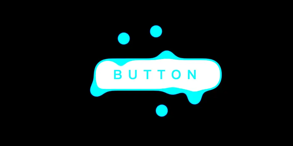
一个具有灵动水滴特效的按钮。背景由多个小圆点组成,这些圆点按照一定的动画路径移动,形成了流体的效果,动态环绕着按钮四周。
代码分析
HTML结构:
- 整个页面包含一个
<div>元素,类名为container,用于容纳所有内容。 container内部有一个<div>元素,类名为bg,作为背景层。bg内部有八个<div>元素,类名为dot,这些是构成水滴效果的小圆点。bg内部还有一个<button>元素,类名为btn,作为按钮。
CSS样式:
- 全局样式 (
body):- 设置页面背景为黑色。
- 设置页面高度为视口高度的100%,并使用网格布局将内容居中。
- 容器样式 (
.container):- 设置容器的高度和宽度均为400px,并使其成为圆形。
- 使用Flexbox布局将内容居中对齐,并隐藏溢出的内容。
- 缩小容器到原来的65%。
- 伪元素样式 (
.container::before):- 在容器中显示文本“button”,设置其颜色、字体、位置等属性。
- 设置绝对定位和较高的z-index以确保文本显示在最上层。
- 背景样式 (
.container .bg):- 设置背景的高度和宽度为100%,并使其成为圆形。
- 使用相对定位和Flexbox布局将内容居中对齐。
- 设置背景颜色为黑色,并应用模糊和对比度滤镜以增加视觉效果。
- 水滴样式 (
.container .dot):- 设置每个水滴的高度和宽度均为40px,并使其成为圆形。
- 设置绝对定位和较高的z-index以确保水滴显示在背景之上。
- 应用水滴动画,使水滴产生流动效果。
- 不同水滴的样式 (
.container .dot:nth-of-type(n)):- 为不同的水滴设置不同的动画延迟和旋转角度,以实现错落有序的效果。
- 按钮样式 (
.container .btn):- 设置按钮的位置、尺寸、背景颜色、边框、圆角等属性。
- 设置绝对定位和较低的z-index以确保按钮位于水滴之下。
- 水滴动画 (
.liquid):- 定义了一个复杂的动画序列,使水滴从初始位置移动到多个目标位置,并改变背景颜色。
- 动画持续时间为15秒,并无限循环播放。
<!DOCTYPE html>
<html lang="en">
<head>
    <meta charset="UTF-8">
    <meta name="viewport" content="width=device-width, initial-scale=1.0">
    <title>水滴按钮</title>
    <style>
      body {
        background: #000;
        height: 100vh;
        display: grid;
        place-content: center;
      }
      .container {
        height: 400px;
        width: 400px;
        overflow: hidden;
        display: flex;
        align-items: center;
        justify-content: center;
        border-radius: 50%; /* 设置容器为圆形 */
        scale: 0.65; /* 缩小容器到原来的65% */
      }
      .container::before {
        content: "button";
        color: #00faff;
        position: absolute;
        z-index: 1; /* 设置层级,确保在背景之上 */
        background-color: transparent; /* 背景透明 */
        font-size: 2rem;
        text-transform: uppercase; /* 文本转换为大写 */
        font-weight: 600;
        letter-spacing: 15px; /* 设置字母间距 */
        font-family: sans-serif;
        cursor: pointer;
      }
      .container .bg {
        height: 100%;
        width: 100%;
        border-radius: 50%;
        position: relative;
        flex-direction: row;
        flex-wrap: wrap;
        display: flex;
        align-items: center;
        justify-content: center;
        background-color: black;
        filter: blur(12px) contrast(20); /* 应用模糊和对比度滤镜 */
      }
      .container .dot {
        position: absolute;
        width: 40px; /* 设置点的宽度为40px */
        height: 40px; /* 设置点的高度为40px */
        border-radius: 50%; /* 设置点为圆形 */
        z-index: 2; /* 设置层级,确保在背景之上 */
        animation: liquid 15000ms cubic-bezier(0.215, 0.61, 0.355, 1) 0s infinite normal both; /* 应用水滴动画 */
      }

      .container .dot:nth-of-type(2) {
        animation-delay: 1000ms; /* 设置第二个点的动画延迟 */
        rotate: 10deg; /* 设置第二个点的旋转角度 */
      }
      .container .dot:nth-of-type(3) {
        animation-delay: 2000ms; /* 设置第三个点的动画延迟 */
        rotate: 30deg; /* 设置第三个点的旋转角度 */
      }
      .container .dot:nth-of-type(4) {
        animation-delay: 3000ms; /* 设置第四个点的动画延迟 */
        rotate: -50deg; /* 设置第四个点的旋转角度 */
      }
      .container .dot:nth-of-type(5) {
        animation-delay: 4000ms; /* 设置第五个点的动画延迟 */
        rotate: -10deg; /* 设置第五个点的旋转角度 */
      }
      .container .dot:nth-of-type(6) {
        animation-delay: 5000ms; /* 设置第六个点的动画延迟 */
        rotate: -15deg; /* 设置第六个点的旋转角度 */
      }
      .container .dot:nth-of-type(7) {
        animation-delay: 6000ms; /* 设置第七个点的动画延迟 */
        rotate: 20deg; /* 设置第七个点的旋转角度 */
      }
      .container .dot:nth-of-type(8) {
        animation-delay: 7000ms; /* 设置第八个点的动画延迟 */
        rotate: 60deg; /* 设置第八个点的旋转角度 */
      }
      .container .btn {
        position: absolute;
        top: calc(50% - 40px); /* 设置按钮顶部位置 */
        left: calc(50% - 160px); /* 设置按钮左侧位置 */
        background-color: white; /* 设置按钮背景颜色为白色 */
        width: 320px; /* 设置按钮宽度为320px */
        border-radius: 30px; /* 设置按钮圆角 */
        height: 80px; /* 设置按钮高度为80px */
        padding: 10px; /* 设置按钮内边距 */
        z-index: 0; /* 设置层级 */
        border: 7px solid #00faff; /* 设置按钮边框 */
        cursor: pointer; /* 设置鼠标悬停时的光标样式 */
      }

      @keyframes liquid {
        0%, 100% {
          transform: translate(0, 0); /* 初始位置 */
          background-color: white; /* 初始背景颜色 */
        }
        5% {
          transform: translate(-90px, -40px); /* 移动位置 */
          background-color: #00faff; /* 改变背景颜色 */
        }
        10% {
          transform: translate(90px, 40px); /* 移动位置 */
        }
        20% {
          transform: translate(-120px, -60px); /* 移动位置 */
        }
        30% {
          transform: translate(80px, 80px); /* 移动位置 */
        }
        40% {
          transform: translate(80px, -80px); /* 移动位置 */
        }
        50% {
          transform: translate(-150px, 70px); /* 移动位置 */
        }
        60% {
          transform: translate(30px, -50px); /* 移动位置 */
        }
        70% {
          transform: translate(-80px, 80px); /* 移动位置 */
        }
        80% {
          transform: translate(150px, -60px); /* 移动位置 */
        }
        90% {
          transform: translate(-90px, 80px); /* 移动位置 */
        }
        95% {
          background-color: #00faff; /* 改变背景颜色 */
          transform: translate(140px, 20px); /* 移动位置 */
        }
      }
    </style>
</head>
<body>
    <div class="container">
      <div class="bg">
        <div class="dot"></div> <!-- 第一个水滴 -->
        <div class="dot"></div> <!-- 第二个水滴 -->
        <div class="dot"></div> <!-- 第三个水滴 -->
        <div class="dot"></div> <!-- 第四个水滴 -->
        <div class="dot"></div> <!-- 第五个水滴 -->
        <div class="dot"></div> <!-- 第六个水滴 -->
        <div class="dot"></div> <!-- 第七个水滴 -->
        <div class="dot"></div> <!-- 第八个水滴 -->
        <button class="btn"></button> <!-- 按钮 -->
      </div>
    </div>
</body>
</html>
No responses yet