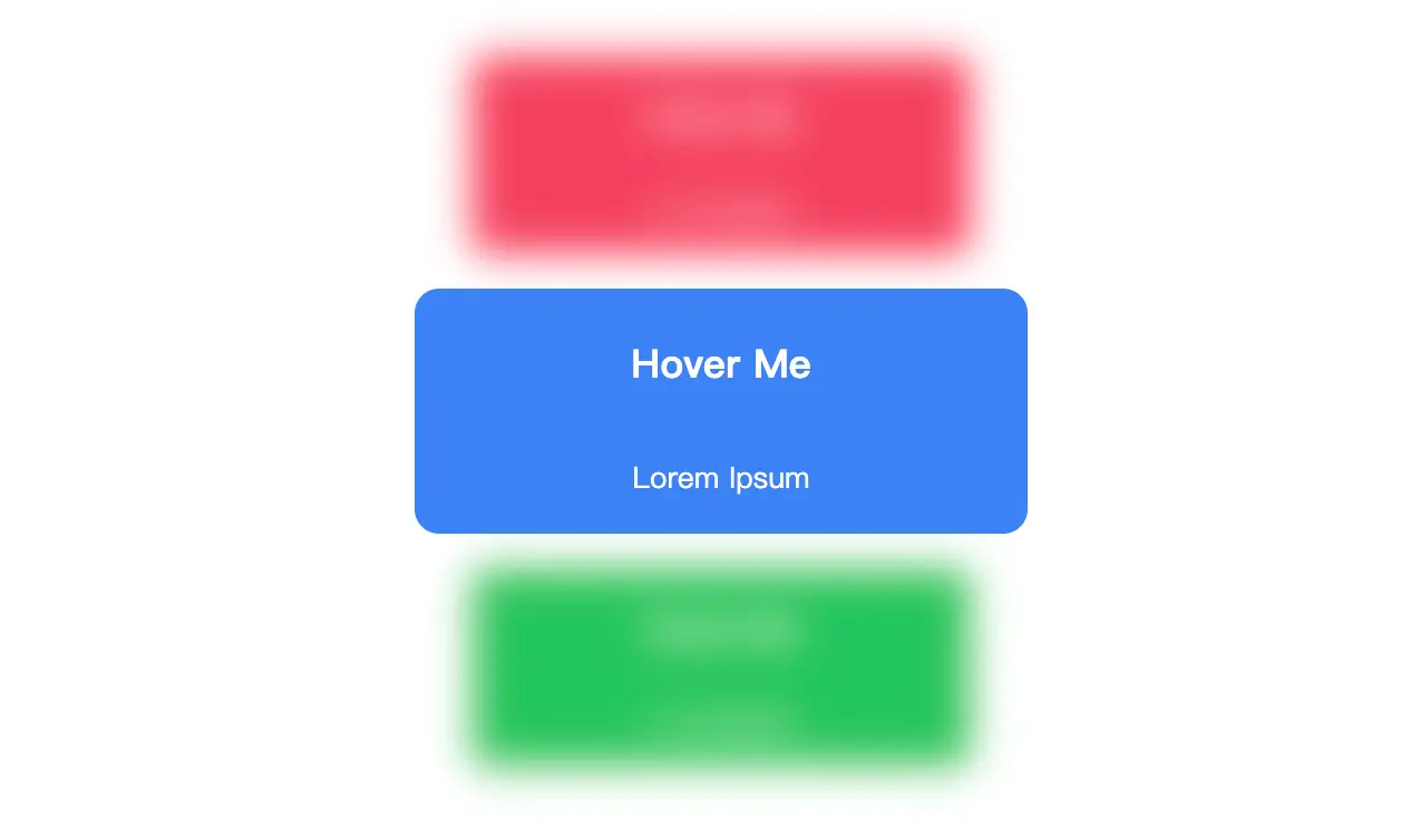
一个包含三个卡片的交互式效果。当用户将鼠标悬停在一个卡片上时,该卡片会放大,并且其他卡片会模糊缩小。
当用户将鼠标悬停在一个卡片上时,该卡片会放大10%,同时其他两个未被悬停的卡片会缩小10%并变得模糊。这种视觉效果通过CSS的:hover伪类和过渡动画来实现,提供了良好的用户体验。整个布局使用了Flexbox来确保卡片在页面中居中对齐,并且卡片之间有一定的间距。
文档结构
- 文档类型声明:
- 声明文档为HTML5格式,确保浏览器以标准模式解析页面。
- HTML根元素:
- 设置页面的语言为英语 (
lang="en"),以便搜索引擎和其他工具更好地理解页面内容。
- 头部信息 (
<head>):
- 字符编码:使用UTF-8编码,支持多种语言的字符集。
- 视口设置:使页面在移动设备上有良好的显示效果,确保宽度适应设备屏幕并初始缩放比例为1.0。
- 标题:页面标题为空,可以根据需要填充具体内容。
- 样式表:内嵌CSS样式,定义了页面的整体布局和交互效果。
- 主体内容 (
<body>):
- 页面的主要内容区域。
- 包含一个
<div>容器,类名为cards,用于包裹所有的卡片。
样式说明
- 整体布局:
- 使用CSS Grid布局将页面内容居中显示。
height: 100vh:设置页面高度为视口高度的100%。display: grid和place-content: center:将内容水平和垂直居中。
- 卡片容器:
- 类名为
cards的<div>是一个Flexbox容器,方向为列(flex-direction: column),卡片之间有15像素的间距(gap: 15px)。
- 单个卡片:
- 每个卡片都有一个基础样式,包括背景颜色、高度、宽度、圆角边框、文本颜色、指针光标以及过渡效果。
- 卡片上的文字分为两行,第一行为提示信息,字体较大且加粗;第二行为辅助文本,字体较小。
- 交互效果:
- 当用户将鼠标悬停在一个卡片上时,该卡片会放大10%(
transform: scale(1.1, 1.1))。 - 同时,其他未被悬停的卡片会模糊处理并缩小10%(
filter: blur(10px); transform: scale(0.9, 0.9)),增强了视觉层次感和互动性。
通过这些设计,页面呈现了一个简洁而富有交互性的卡片展示效果。
<!DOCTYPE html>
<html lang="en">
	<head>
		<meta charset="UTF-8">
		<meta name="viewport" content="width=device-width, initial-scale=1.0">
		<title>交互式卡片悬停效果</title>
		<style>
			body {
				height: 100vh;
				display: grid;
				place-content: center;
			}

			.cards {
				display: flex;
				flex-direction: column;
				gap: 15px;
			}

			.cards .red {
				background-color: #f43f5e;
			}

			.cards .blue {
				background-color: #3b82f6;
			}

			.cards .green {
				background-color: #22c55e;
			}

			.cards .card {
				display: flex;
				align-items: center;
				justify-content: center;
				flex-direction: column;
				text-align: center;
				height: 100px;
				width: 250px;
				border-radius: 10px;
				color: white;
				cursor: pointer;
				transition: 400ms;
			}

			.cards .card p.tip {
				font-size: 1em;
				font-weight: 700;
			}

			.cards .card p.second-text {
				font-size: .7em;
			}

			.cards .card:hover {
				transform: scale(1.1, 1.1);
			}

			.cards:hover>.card:not(:hover) {
				filter: blur(10px);
				transform: scale(0.9, 0.9);
			}
		</style>
	</head>
	<body>
		<div class="cards">
			<div class="card red">
				<p class="tip">Hover Me</p>
				<p class="second-text">Lorem Ipsum</p>
			</div>
			<div class="card blue">
				<p class="tip">Hover Me</p>
				<p class="second-text">Lorem Ipsum</p>
			</div>
			<div class="card green">
				<p class="tip">Hover Me</p>
				<p class="second-text">Lorem Ipsum</p>
			</div>
		</div>
	</body>
</html>
No responses yet