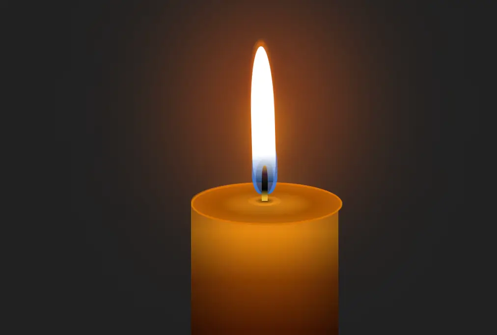
一个纯CSS3制作的跳动的燃烧烛光动画效果。以下是对代码的详细解读:
文档结构
主体内容 (<body>):
- 页面的主要内容区域。
- 包含一个
<div>容器,类名为holder,用于包裹整个烛光动画。 - 在
holder内部,包含四个子<div>元素,分别表示蜡烛、线头、光芒和火焰。
样式说明
整体布局:
body:背景颜色为黑色 (background: #000),高度为视口高度的100% (height: 100vh),使用Grid布局并将内容居中 (display: grid; place-content: center;)。
烛台容器 (holder):
- 宽度为150像素,高度为400像素,相对定位 (
position: relative),底部有12rem的外边距。
通用样式:
- 所有的子元素及其伪元素都继承绝对定位 (
position: absolute; content: "";),便于精确控制位置和形状。
蜡烛 (candle):
- 底部对齐 (
bottom: 0),宽度为150像素,高度为300像素。 - 使用椭圆形边框 (
border-radius: 150px / 40px) 创建蜡烛的形状。 - 内阴影 (
box-shadow) 和渐变背景 (linear-gradient) 给予蜡烛立体感和质感。
火焰顶部 (candle:before):
- 圆形 (
border-radius: 50%),带有金色边框和黄色渐变背景,模拟火焰顶部的亮点。
火焰中心点 (candle:after):
- 小圆点 (
border-radius: 50%),带有阴影效果,模拟火焰中心的小亮斑。
线头 (thread):
- 高度为36像素,位于蜡烛顶部中间,使用线性渐变背景模拟线头的颜色变化。
火焰 (flame):
- 高度为120像素,底部对齐,水平居中 (
left: 50%; transform: translateX(-50%))。 - 使用椭圆形边框 (
border-radius: 50% 50% 20% 20%) 和白色渐变背景创建火焰的形状。 - 添加两个关键帧动画 (
moveFlame和enlargeFlame) 实现火焰的摇曳和大小变化效果。
火焰内部阴影 (flame:before):
- 添加橙色和黄色的阴影效果,增强火焰的真实感。
发光效果 (glow):
- 椭圆形 (
border-radius: 50% 50% 35% 35%),带有蓝色半透明背景和多层阴影效果,模拟烛光周围的光线扩散。
闪烁的光芒 (blinking-glow):
- 大圆形 (
border-radius: 50%),带有橙色半透明背景和模糊滤镜,模拟烛光的闪烁效果。 - 添加关键帧动画 (
blinkIt) 实现闪烁效果。
通过这些精心设计的样式和动画,页面呈现了一个逼真的燃烧烛光效果。
<!DOCTYPE html>
<html lang="en">
	<head>
		<meta charset="UTF-8">
		<meta name="viewport" content="width=device-width, initial-scale=1.0">
		<title>纯CSS3做一个燃烧的烛光动画</title>
		<style>
			body {
				background: #000;
				height: 100vh;
				display: grid;
				place-content: center;
			}
			.holder {
				margin: 12rem auto 0;
				width: 150px;
				height: 400px;
				position: relative;
			}
			.holder *,
			.holder *:before,
			.holder *:after {
				position: absolute;
				content: "";
			}
			.candle {
				bottom: 0;
				width: 150px;
				height: 300px;
				border-radius: 150px / 40px;
				-webkit-box-shadow: inset 20px -30px 50px 0 rgba(0, 0, 0, 0.4), inset -20px 0 50px 0 rgba(0, 0, 0, 0.4);
				box-shadow: inset 20px -30px 50px 0 rgba(0, 0, 0, 0.4), inset -20px 0 50px 0 rgba(0, 0, 0, 0.4);
				background: #190f02;
				background: -webkit-gradient(linear, left top, left bottom, from(#e48825), color-stop(#e78e0e), color-stop(#833c03), color-stop(50%, #4c1a03), to(#1c0900));
				background: linear-gradient(#e48825, #e78e0e, #833c03, #4c1a03 50%, #1c0900);
			}
			.candle:before {
				width: 100%;
				height: 40px;
				border-radius: 50%;
				border: 2px solid #d47401;
				background: #b86409;
				background: radial-gradient(#ffef80, #b86409 60%);
				background: radial-gradient(#eaa121, #8e4901 45%, #b86409 80%);
			}
			.candle:after {
				width: 34px;
				height: 10px;
				left: 50%;
				-webkit-transform: translateX(-50%);
				-ms-transform: translateX(-50%);
				transform: translateX(-50%);
				border-radius: 50%;
				top: 14px;
				-webkit-box-shadow: 0 0 20px 0 rgba(0, 0, 0, 0.5);
				box-shadow: 0 0 20px 0 rgba(0, 0, 0, 0.5);
				background: radial-gradient(rgba(0, 0, 0, 0.6), transparent 45%);
			}
			.thread {
				width: 6px;
				height: 36px;
				top: -17px;
				left: 50%;
				z-index: 1;
				border-radius: 40% 40% 0 0;
				-webkit-transform: translateX(-50%);
				-ms-transform: translateX(-50%);
				transform: translateX(-50%);
				background: #121212;
				background: -webkit-gradient(linear, left top, left bottom, from(#d6994a), color-stop(#4b232c), color-stop(#121212), color-stop(black), color-stop(90%, #e8bb31));
				background: linear-gradient(#d6994a, #4b232c, #121212, black, #e8bb31 90%);
			}
			.flame {
				width: 24px;
				height: 120px;
				left: 50%;
				-webkit-transform-origin: 50% 100%;
				-ms-transform-origin: 50% 100%;
				transform-origin: 50% 100%;
				-webkit-transform: translateX(-50%);
				-ms-transform: translateX(-50%);
				transform: translateX(-50%);
				bottom: 100%;
				border-radius: 50% 50% 20% 20%;
				background: rgba(255, 255, 255, 1);
				background: -webkit-gradient(linear, left top, left bottom, color-stop(80%, white), to(transparent));
				background: linear-gradient(white 80%, transparent);
				-webkit-animation: moveFlame 6s linear infinite, enlargeFlame 5s linear infinite;
				animation: moveFlame 6s linear infinite, enlargeFlame 5s linear infinite;
			}
			.flame:before {
				width: 100%;
				height: 100%;
				border-radius: 50% 50% 20% 20%;
				-webkit-box-shadow: 0 0 15px 0 rgba(247, 93, 0, .4), 0 -6px 4px 0 rgba(247, 128, 0, .7);
				box-shadow: 0 0 15px 0 rgba(247, 93, 0, .4), 0 -6px 4px 0 rgba(247, 128, 0, .7);
			}
			@-webkit-keyframes moveFlame {
				0%,
				100% {
					-webkit-transform: translateX(-50%) rotate(-2deg);
					transform: translateX(-50%) rotate(-2deg);
				}

				50% {
					-webkit-transform: translateX(-50%) rotate(2deg);
					transform: translateX(-50%) rotate(2deg);
				}
			}
			@keyframes moveFlame {
				0%,
				100% {
					-webkit-transform: translateX(-50%) rotate(-2deg);
					transform: translateX(-50%) rotate(-2deg);
				}
				50% {
					-webkit-transform: translateX(-50%) rotate(2deg);
					transform: translateX(-50%) rotate(2deg);
				}
			}
			@-webkit-keyframes enlargeFlame {
				0%,
				100% {
					height: 120px;
				}
				50% {
					height: 140px;
				}
			}
			@keyframes enlargeFlame {
				0%,
				100% {
					height: 120px;
				}

				50% {
					height: 140px;
				}
			}
			.glow {
				width: 26px;
				height: 60px;
				border-radius: 50% 50% 35% 35%;
				left: 50%;
				top: -48px;
				-webkit-transform: translateX(-50%);
				-ms-transform: translateX(-50%);
				transform: translateX(-50%);
				background: rgba(0, 133, 255, .7);
				-webkit-box-shadow: 0 -40px 30px 0 #dc8a0c, 0 40px 50px 0 #dc8a0c, inset 3px 0 2px 0 rgba(0, 133, 255, .6), inset -3px 0 2px 0 rgba(0, 133, 255, .6);
				box-shadow: 0 -40px 30px 0 #dc8a0c, 0 40px 50px 0 #dc8a0c, inset 3px 0 2px 0 rgba(0, 133, 255, .6), inset -3px 0 2px 0 rgba(0, 133, 255, .6);
			}
			.glow:before {
				width: 70%;
				height: 60%;
				left: 50%;
				-webkit-transform: translateX(-50%);
				-ms-transform: translateX(-50%);
				transform: translateX(-50%);
				bottom: 0;
				border-radius: 50%;
				background: rgba(0, 0, 0, 0.35);
			}
			.blinking-glow {
				width: 100px;
				height: 180px;
				left: 50%;
				top: -55%;
				-webkit-transform: translateX(-50%);
				-ms-transform: translateX(-50%);
				transform: translateX(-50%);
				border-radius: 50%;
				background: #ff6000;
				-webkit-filter: blur(50px);
				-moz-filter: blur(60px);
				-o-filter: blur(60px);
				-ms-filter: blur(60px);
				filter: blur(60px);
				-webkit-animation: blinkIt .1s infinite;
				animation: blinkIt .1s infinite;
			}
			@-webkit-keyframes blinkIt {
				50% {
					opacity: .8;
				}
			}
			@keyframes blinkIt {
				50% {
					opacity: .8;
				}
			}
		</style>
	</head>
	<body>
		<div class="holder">
			<div class="candle">
				<div class="blinking-glow"></div>
				<div class="thread"></div>
				<div class="glow"></div>
				<div class="flame"></div>
			</div>
		</div>
	</body>
</html>
No responses yet