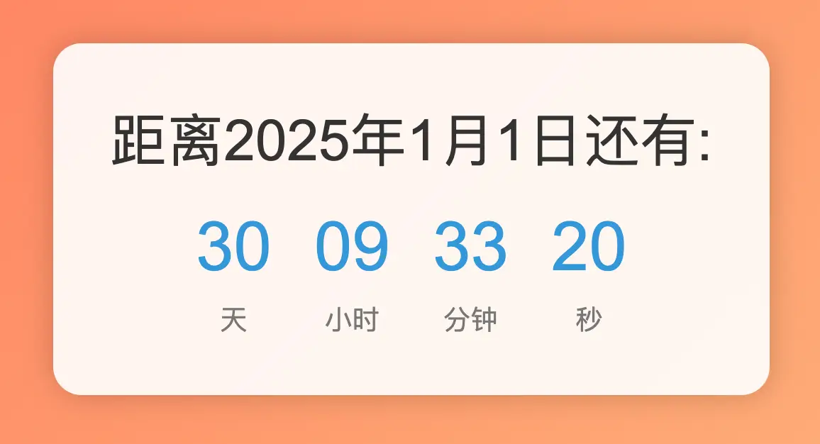
我们创建一个简单的2025年倒计时效果,显示距离2025年1月1日还有多少天、小时、分钟和秒。
关键点总结
- HTML结构:
- 使用一个容器
countdown-container来包裹整个倒计时内容。 - 包含标题
countdown-title和时间显示部分countdown-time。 - 每个时间单位(天、小时、分钟、秒)分别放在
time-section中。
- CSS样式:
- 设置
body的背景为线性渐变,从#ff7e5f到#feb47b。 - 将
countdown-container定位在页面中心,并设置其背景颜色、内边距、圆角和阴影。 - 添加
backdrop-filter: blur(10px)使背景模糊,增加视觉深度。 - 设置标题和时间显示的字体大小和颜色,并添加淡入动画
fadeIn。 - 设置每个时间单位的样式,使其对齐并居中显示,并添加弹跳动画
bounceIn。
- JavaScript实现:
- 获取当前日期和目标日期(2025年1月1日)。
- 计算剩余的时间差,并将其转换为天、小时、分钟和秒。
- 更新页面上的各个时间单元。
- 使用
setInterval每秒更新一次倒计时。
<!DOCTYPE html>
<html lang="zh-CN">
<head>
    <meta charset="UTF-8">
    <meta name="viewport" content="width=device-width, initial-scale=1.0">
    <title>2025年倒计时效果</title>
    <style>
        body {
            display: flex;
            justify-content: center;
            align-items: center;
            height: 100vh;
            margin: 0;
            font-family: 'Arial', sans-serif;
            background: linear-gradient(135deg, #ff7e5f, #feb47b);
            overflow: hidden;
        }
        .countdown-container {
            text-align: center;
            background-color: rgba(255, 255, 255, 0.9);
            padding: 40px;
            border-radius: 20px;
            box-shadow: 0 0 20px rgba(0, 0, 0, 0.2);
            backdrop-filter: blur(10px);
        }
        .countdown-title {
            font-size: 2.5em;
            color: #333;
            margin-bottom: 20px;
            animation: fadeIn 2s ease-in-out forwards;
        }
        .countdown-time {
            font-size: 1.5em;
            color: #3498db;
            margin-bottom: 20px;
            animation: fadeIn 2s ease-in-out forwards;
        }
        .time-sections {
            display: flex;
            justify-content: center;
            gap: 30px;
        }
        .time-section {
            text-align: center;
            animation: bounceIn 2s ease-in-out forwards;
        }
        .time-value {
            font-size: 3em;
            color: #3498db;
            margin-bottom: 10px;
        }
        .time-label {
            font-size: 1.2em;
            color: #777;
        }
        @keyframes fadeIn {
            from { opacity: 0; transform: translateY(-20px); }
            to { opacity: 1; transform: translateY(0); }
        }
        @keyframes bounceIn {
            from, 20%, 40%, 60%, 80%, to { animation-timing-function: cubic-bezier(0.215, 0.610, 0.355, 1.000); }
            0% { opacity: 0; transform: scale3d(.3, .3, .3); }
            20% { transform: scale3d(1.1, 1.1, 1.1); }
            40% { transform: scale3d(.9, .9, .9); }
            60% { opacity: 1; transform: scale3d(1.03, 1.03, 1.03); }
            80% { transform: scale3d(.97, .97, .97); }
            to { opacity: 1; transform: scale3d(1, 1, 1); }
        }
    </style>
</head>
<body>
    <div class="countdown-container">
        <div class="countdown-title">距离2025年1月1日还有:</div>
        <div class="countdown-time" id="countdown-time"></div>
        <div class="time-sections">
            <div class="time-section">
                <div id="days" class="time-value">00</div>
                <div class="time-label">天</div>
            </div>
            <div class="time-section">
                <div id="hours" class="time-value">00</div>
                <div class="time-label">小时</div>
            </div>
            <div class="time-section">
                <div id="minutes" class="time-value">00</div>
                <div class="time-label">分钟</div>
            </div>
            <div class="time-section">
                <div id="seconds" class="time-value">00</div>
                <div class="time-label">秒</div>
            </div>
        </div>
    </div>

    <script>
        function updateCountdown() {
            const now = new Date();
            const targetDate = new Date("January 1, 2025 00:00:00");
            const timeDifference = targetDate - now;

            if (timeDifference <= 0) {
                document.getElementById('countdown-time').innerText = "新年快乐!";
                document.getElementById('days').innerText = "00";
                document.getElementById('hours').innerText = "00";
                document.getElementById('minutes').innerText = "00";
                document.getElementById('seconds').innerText = "00";
                clearInterval(interval);
                return;
            }

            const days = Math.floor(timeDifference / (1000 * 60 * 60 * 24));
            const hours = Math.floor((timeDifference % (1000 * 60 * 60 * 24)) / (1000 * 60 * 60));
            const minutes = Math.floor((timeDifference % (1000 * 60 * 60)) / (1000 * 60));
            const seconds = Math.floor((timeDifference % (1000 * 60)) / 1000);

            document.getElementById('days').innerText = String(days).padStart(2, '0');
            document.getElementById('hours').innerText = String(hours).padStart(2, '0');
            document.getElementById('minutes').innerText = String(minutes).padStart(2, '0');
            document.getElementById('seconds').innerText = String(seconds).padStart(2, '0');
        }

        updateCountdown();
        const interval = setInterval(updateCountdown, 1000);
    </script>
</body>
</html>
No responses yet