霓虹灯文字特效是一种非常吸引眼球的效果,通常带有闪烁和颜色变化的特点。下面是一个实现霓虹灯文字特效的示例代码:
关键点总结
- HTML结构:
- 使用一个
div元素来包含文字内容。
- CSS样式:
- 设置
body的背景颜色为黑色 (#000)。 - 将
.neon-text文字设置为较大的字体大小,并使用绿色 (#39ff14) 作为基本颜色。 - 使用
text-shadow属性创建多层阴影效果,模拟霓虹灯的发光效果。 - 添加
neonPulse动画,使文字的阴影在不同强度之间脉冲变化,增加动态效果。
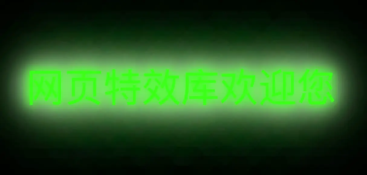
运行效果
运行下面代码后,你会看到“网页特效库”这几个字以霓虹灯的效果展示,带有闪烁和颜色变化的视觉效果。
<!DOCTYPE html>
<html lang="zh-CN">
<head>
    <meta charset="UTF-8">
    <meta name="viewport" content="width=device-width, initial-scale=1.0">
    <title>霓虹灯文字特效</title>
    <style>
        body {
            display: flex;
            justify-content: center;
            align-items: center;
            height: 100vh;
            background-color: #000;
            margin: 0;
            font-family: 'Arial', sans-serif;
        }
        .neon-text {
            font-size: 4em;
            color: #39ff14;
            text-shadow:
                0 0 5px #39ff14,
                0 0 10px #39ff14,
                0 0 15px #39ff14,
                0 0 20px #39ff14,
                0 0 25px #fff,
                0 0 30px #fff,
                0 0 35px #fff,
                0 0 40px #fff,
                0 0 70px #39ff14,
                0 0 80px #39ff14,
                0 0 100px #39ff14,
                0 0 150px #39ff14;
            animation: neonPulse 1.5s ease-in-out infinite alternate;
        }
        @keyframes neonPulse {
            from {
                text-shadow:
                    0 0 5px #39ff14,
                    0 0 10px #39ff14,
                    0 0 15px #39ff14,
                    0 0 20px #39ff14,
                    0 0 25px #fff,
                    0 0 30px #fff,
                    0 0 35px #fff,
                    0 0 40px #fff,
                    0 0 70px #39ff14,
                    0 0 80px #39ff14,
                    0 0 100px #39ff14,
                    0 0 150px #39ff14;
            }
            to {
                text-shadow:
                    0 0 20px #39ff14,
                    0 0 30px #39ff14,
                    0 0 40px #39ff14,
                    0 0 50px #39ff14,
                    0 0 60px #fff,
                    0 0 70px #fff,
                    0 0 80px #fff,
                    0 0 90px #fff,
                    0 0 100px #39ff14,
                    0 0 150px #39ff14,
                    0 0 200px #39ff14,
                    0 0 250px #39ff14;
            }
        }
    </style>
</head>
<body>
    <div class="neon-text">网页特效库欢迎您</div>
</body>
</html>
No responses yet