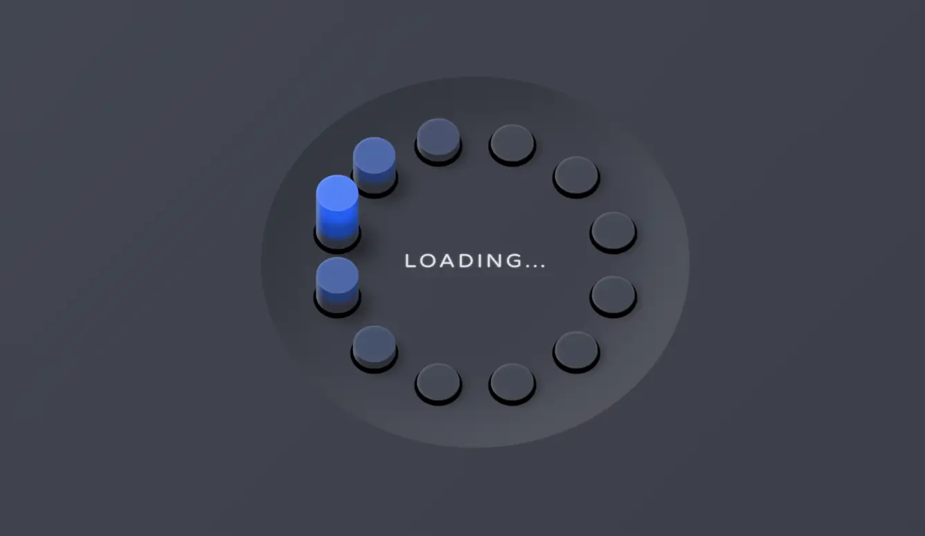
这个示例展示了一个基于 CSS3 的 3D 加载进度动画。页面的主要组成部分是一个由十二个点组成的圆形加载器,每个点都有独特的动画效果。这些点围绕一个中心点排列,并且每个点都通过 CSS 动画进行动态变化。加载器周围有一个带有渐变背景的深色背景,整体效果给人一种立体感和动感。此外,加载器中央还显示了“Loading…”的文本,提示用户系统正在加载数据或处理任务。
代码说明
- HTML 结构:
- 使用
<!DOCTYPE html>声明文档类型为 HTML5。 <meta name="viewport">确保页面在不同设备上都能正确缩放和显示。<style>标签内定义了所有的 CSS 样式。<body>包含主容器.pl和加载文本。.pl是主容器,包含了十二个.pl__dot子元素和一个.pl__text文本元素。
- 使用
- CSS 样式:
- 全局样式部分移除了所有元素的默认边框、填充和外边距,确保页面整洁统一。
- 定义了一些全局变量,包括背景色、文字颜色、主要颜色等,方便在整个页面中复用。
body设置了页面的背景颜色为深色,并添加了一个从左上到右下的线性渐变背景,增强了视觉效果。.pl类设置了加载器容器的样式,包括阴影效果、Flexbox 布局、旋转效果等,使其看起来像是一个悬浮在空中的 3D 对象。.pl, .pl__dot设置了加载器容器和点的圆角,使它们呈现圆形外观。.pl__dot类设置了每个点的基本样式,包括动画名称、阴影、位置和尺寸。.pl__dot, .pl__dot:before, .pl__dot:after设置了点及其伪元素的动画持续时间和迭代次数,使得动画能够无限循环。.pl__dot:before和.pl__dot:after分别设置了两个伪元素的内容和显示方式,这两个伪元素共同构成了每个点的复杂动画效果。.pl__dot:nth-child(n)设置了第 n 个点的具体位置和动画延迟,通过不同的延迟时间实现了点的错位动画效果。.pl__text设置了加载文本的样式,包括字体大小、最大宽度、相对定位和旋转效果,使其与整个加载器保持一致的风格。@keyframes shadow定义了阴影动画的效果,使得点的阴影在动画过程中发生变化。@keyframes pushInOut1和@keyframes pushInOut2分别定义了两个伪元素的推入和推出动画效果,增加了动画的层次感和动态效果。
通过这些样式的组合和动画效果的应用,一个美观且富有动感的 3D 加载进度动画就完成咯,极大的提升了用户体验。
<!DOCTYPE html>
<html lang="en" >
<head>
  <meta charset="UTF-8">
  <title>CSS3 3D 加载进度动画DEMO演示</title>
  <meta name="viewport" content="width=device-width, initial-scale=1, viewport-fit=cover">
  <style>
	  * {
	    border: 0;
	    box-sizing: border-box;
	    margin: 0;
	    padding: 0;
	  }

	  :root {
	    --bg: #454954;
	    --fg: #e3e4e8;
	    --fg-t: rgba(227, 228, 232, 0.5);
	    --primary1: #255ff4;
	    --primary2: #5583f6;
	    --trans-dur: 0.3s;
	    font-size: calc(16px + (20 - 16) * (100vw - 320px) / (1280 - 320));
	  }

	  body {
	    background-color: var(--bg);
	    background-image: linear-gradient(135deg, rgba(0, 0, 0, 0), rgba(0, 0, 0, 0.2));
	    color: var(--fg);
	    font: 1em/1.5 "Varela Round", Helvetica, sans-serif;
	    height: 100vh;
	    min-height: 360px;
	    display: grid;
	    place-items: center;
	    transition: background-color var(--trans-dur), color var(--trans-dur);
	  }

	  .pl {
	    box-shadow: 2em 0 2em rgba(0, 0, 0, 0.2) inset, -2em 0 2em rgba(255, 255, 255, 0.1) inset;
	    display: flex;
	    justify-content: center;
	    align-items: center;
	    position: relative;
	    letter-spacing: 0.1em;
	    text-transform: uppercase;
	    transform: rotateX(30deg) rotateZ(45deg);
	    width: 15em;
	    height: 15em;
	  }
	  .pl, .pl__dot {
	    border-radius: 50%;
	  }
	  .pl__dot {
	    animation-name: shadow;
	    box-shadow: 0.1em 0.1em 0 0.1em black, 0.3em 0 0.3em rgba(0, 0, 0, 0.5);
	    top: calc(50% - 0.75em);
	    left: calc(50% - 0.75em);
	    width: 1.5em;
	    height: 1.5em;
	  }
	  .pl__dot, .pl__dot:before, .pl__dot:after {
	    animation-duration: 2s;
	    animation-iteration-count: infinite;
	    position: absolute;
	  }
	  .pl__dot:before, .pl__dot:after {
	    content: "";
	    display: block;
	    left: 0;
	    width: inherit;
	    transition: background-color var(--trans-dur);
	  }
	  .pl__dot:before {
	    animation-name: pushInOut1;
	    background-color: var(--bg);
	    border-radius: inherit;
	    box-shadow: 0.05em 0 0.1em rgba(255, 255, 255, 0.2) inset;
	    height: inherit;
	    z-index: 1;
	  }
	  .pl__dot:after {
	    animation-name: pushInOut2;
	    background-color: var(--primary1);
	    border-radius: 0.75em;
	    box-shadow: 0.1em 0.3em 0.2em rgba(255, 255, 255, 0.4) inset, 0 -0.4em 0.2em #2e3138 inset, 0 -1em 0.25em rgba(0, 0, 0, 0.3) inset;
	    bottom: 0;
	    clip-path: polygon(0 75%, 100% 75%, 100% 100%, 0 100%);
	    height: 3em;
	    transform: rotate(-45deg);
	    transform-origin: 50% 2.25em;
	  }
	  .pl__dot:nth-child(1) {
	    transform: rotate(0deg) translateX(5em) rotate(0deg);
	    z-index: 5;
	  }
	  .pl__dot:nth-child(1), .pl__dot:nth-child(1):before, .pl__dot:nth-child(1):after {
	    animation-delay: 0s;
	  }
	  .pl__dot:nth-child(2) {
	    transform: rotate(-30deg) translateX(5em) rotate(30deg);
	    z-index: 4;
	  }
	  .pl__dot:nth-child(2), .pl__dot:nth-child(2):before, .pl__dot:nth-child(2):after {
	    animation-delay: -0.1666666667s;
	  }
	  .pl__dot:nth-child(3) {
	    transform: rotate(-60deg) translateX(5em) rotate(60deg);
	    z-index: 3;
	  }
	  .pl__dot:nth-child(3), .pl__dot:nth-child(3):before, .pl__dot:nth-child(3):after {
	    animation-delay: -0.3333333333s;
	  }
	  .pl__dot:nth-child(4) {
	    transform: rotate(-90deg) translateX(5em) rotate(90deg);
	    z-index: 2;
	  }
	  .pl__dot:nth-child(4), .pl__dot:nth-child(4):before, .pl__dot:nth-child(4):after {
	    animation-delay: -0.5s;
	  }
	  .pl__dot:nth-child(5) {
	    transform: rotate(-120deg) translateX(5em) rotate(120deg);
	    z-index: 1;
	  }
	  .pl__dot:nth-child(5), .pl__dot:nth-child(5):before, .pl__dot:nth-child(5):after {
	    animation-delay: -0.6666666667s;
	  }
	  .pl__dot:nth-child(6) {
	    transform: rotate(-150deg) translateX(5em) rotate(150deg);
	    z-index: 1;
	  }
	  .pl__dot:nth-child(6), .pl__dot:nth-child(6):before, .pl__dot:nth-child(6):after {
	    animation-delay: -0.8333333333s;
	  }
	  .pl__dot:nth-child(7) {
	    transform: rotate(-180deg) translateX(5em) rotate(180deg);
	    z-index: 2;
	  }
	  .pl__dot:nth-child(7), .pl__dot:nth-child(7):before, .pl__dot:nth-child(7):after {
	    animation-delay: -1s;
	  }
	  .pl__dot:nth-child(8) {
	    transform: rotate(-210deg) translateX(5em) rotate(210deg);
	    z-index: 3;
	  }
	  .pl__dot:nth-child(8), .pl__dot:nth-child(8):before, .pl__dot:nth-child(8):after {
	    animation-delay: -1.1666666667s;
	  }
	  .pl__dot:nth-child(9) {
	    transform: rotate(-240deg) translateX(5em) rotate(240deg);
	    z-index: 4;
	  }
	  .pl__dot:nth-child(9), .pl__dot:nth-child(9):before, .pl__dot:nth-child(9):after {
	    animation-delay: -1.3333333333s;
	  }
	  .pl__dot:nth-child(10) {
	    transform: rotate(-270deg) translateX(5em) rotate(270deg);
	    z-index: 5;
	  }
	  .pl__dot:nth-child(10), .pl__dot:nth-child(10):before, .pl__dot:nth-child(10):after {
	    animation-delay: -1.5s;
	  }
	  .pl__dot:nth-child(11) {
	    transform: rotate(-300deg) translateX(5em) rotate(300deg);
	    z-index: 6;
	  }
	  .pl__dot:nth-child(11), .pl__dot:nth-child(11):before, .pl__dot:nth-child(11):after {
	    animation-delay: -1.6666666667s;
	  }
	  .pl__dot:nth-child(12) {
	    transform: rotate(-330deg) translateX(5em) rotate(330deg);
	    z-index: 6;
	  }
	  .pl__dot:nth-child(12), .pl__dot:nth-child(12):before, .pl__dot:nth-child(12):after {
	    animation-delay: -1.8333333333s;
	  }
	  .pl__text {
	    font-size: 0.75em;
	    max-width: 5rem;
	    position: relative;
	    text-shadow: 0 0 0.1em var(--fg-t);
	    transform: rotateZ(-45deg);
	  }

	  /* Animations */
	  @keyframes shadow {
	    from {
	      animation-timing-function: ease-in;
	      box-shadow: 0.1em 0.1em 0 0.1em black, 0.3em 0 0.3em rgba(0, 0, 0, 0.3);
	    }
	    25% {
	      animation-timing-function: ease-out;
	      box-shadow: 0.1em 0.1em 0 0.1em black, 0.8em 0 0.8em rgba(0, 0, 0, 0.5);
	    }
	    50%, to {
	      box-shadow: 0.1em 0.1em 0 0.1em black, 0.3em 0 0.3em rgba(0, 0, 0, 0.3);
	    }
	  }
	  @keyframes pushInOut1 {
	    from {
	      animation-timing-function: ease-in;
	      background-color: var(--bg);
	      transform: translate(0, 0);
	    }
	    25% {
	      animation-timing-function: ease-out;
	      background-color: var(--primary2);
	      transform: translate(-71%, -71%);
	    }
	    50%, to {
	      background-color: var(--bg);
	      transform: translate(0, 0);
	    }
	  }
	  @keyframes pushInOut2 {
	    from {
	      animation-timing-function: ease-in;
	      background-color: var(--bg);
	      clip-path: polygon(0 75%, 100% 75%, 100% 100%, 0 100%);
	    }
	    25% {
	      animation-timing-function: ease-out;
	      background-color: var(--primary1);
	      clip-path: polygon(0 25%, 100% 25%, 100% 100%, 0 100%);
	    }
	    50%, to {
	      background-color: var(--bg);
	      clip-path: polygon(0 75%, 100% 75%, 100% 100%, 0 100%);
	    }
	  }
  </style>
</head>
<body>
<div class="pl">
	<div class="pl__dot"></div>
	<div class="pl__dot"></div>
	<div class="pl__dot"></div>
	<div class="pl__dot"></div>
	<div class="pl__dot"></div>
	<div class="pl__dot"></div>
	<div class="pl__dot"></div>
	<div class="pl__dot"></div>
	<div class="pl__dot"></div>
	<div class="pl__dot"></div>
	<div class="pl__dot"></div>
	<div class="pl__dot"></div>
	<div class="pl__text">Loading…</div>
</div>

<div style="text-align:center;clear:both;">
</div>

</body>
</html>
No responses yet