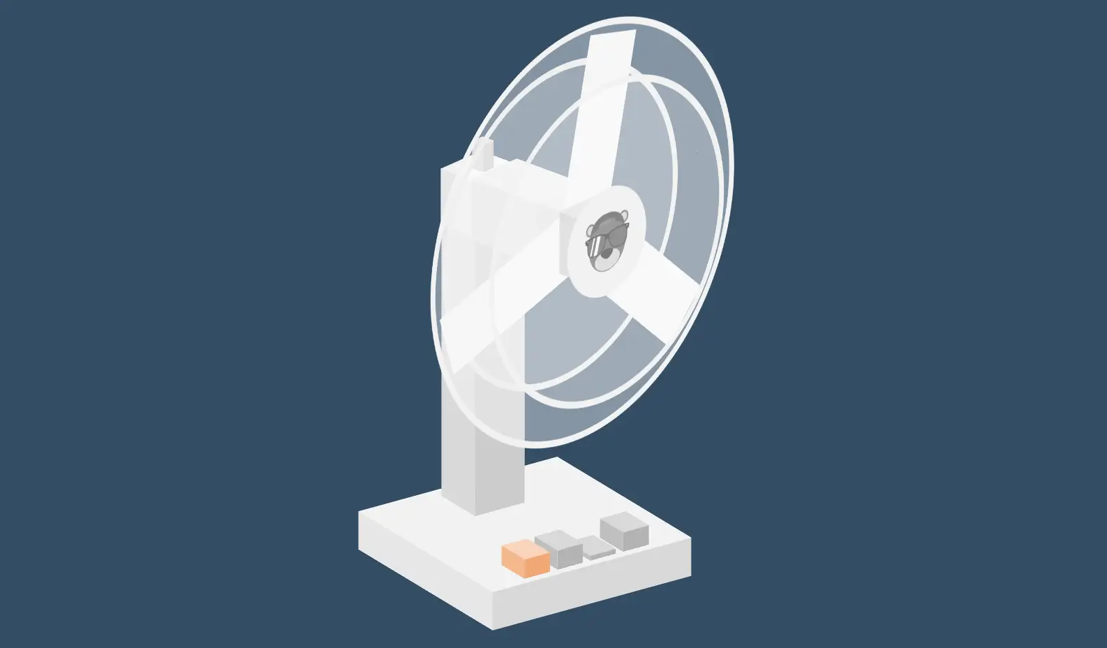
一个纯 CSS3 实现的电风扇动画,效果超棒!电风扇能够正常旋转,并且控制选项能够正确切换不同的速度。以下是完整的代码,包括 HTML 和 CSS:
代码说明
- HTML结构:
- 包含四个
input类型为radio的元素,用于控制电风扇的速度。 - 使用多个
div元素来构建电风扇的不同部分,如底座、控制面板、轴心、叶片等。
- 包含四个
- CSS样式:
- 基本重置样式,去除默认的边距和填充。
- 设置
body为 Flexbox 容器,使内容居中显示。 - 定义
.scene类来设置场景的基本样式。 - 使用
.cuboid类来创建立方体结构,并定义其各个面的样式。 - 使用
@keyframes spin来定义旋转动画。 - 使用
input[type="radio"]:checked ~ .fan .fan__rotater来根据选中的 radio 按钮应用不同的动画速度:#zero:暂停旋转。#one:以2秒周期旋转。#two:以1秒周期旋转。#three:以0.5秒周期旋转。
通过这种方式,我们确保了电风扇能够根据不同的速度选项进行旋转,并且默认情况下电风扇会以较慢的速度(2秒周期)旋转。你可以通过点击不同的控制按钮来调整电风扇的速度。
<!DOCTYPE html>
<html lang="en">
<head>
    <meta charset="UTF-8">
    <meta name="viewport" content="width=device-width, initial-scale=1.0">
    <title>纯CSS3电风扇动画</title>
    <style>
		button,hr,input{overflow:visible}audio,canvas,progress,video{display:inline-block}progress,sub,sup{vertical-align:baseline}html{font-family:sans-serif;line-height:1.15;-ms-text-size-adjust:100%;-webkit-text-size-adjust:100%}body{margin:0} menu,article,aside,details,footer,header,nav,section{display:block}h1{font-size:2em;margin:.67em 0}figcaption,figure,main{display:block}figure{margin:1em 40px}hr{box-sizing:content-box;height:0}code,kbd,pre,samp{font-family:monospace,monospace;font-size:1em}a{background-color:transparent;-webkit-text-decoration-skip:objects}a:active,a:hover{outline-width:0}abbr[title]{border-bottom:none;text-decoration:underline;text-decoration:underline dotted}b,strong{font-weight:bolder}dfn{font-style:italic}mark{background-color:#ff0;color:#000}small{font-size:80%}sub,sup{font-size:75%;line-height:0;position:relative}sub{bottom:-.25em}sup{top:-.5em}audio:not([controls]){display:none;height:0}img{border-style:none}svg:not(:root){overflow:hidden}button,input,optgroup,select,textarea{font-family:sans-serif;font-size:100%;line-height:1.15;margin:0}button,input{}button,select{text-transform:none}[type=submit], [type=reset],button,html [type=button]{-webkit-appearance:button}[type=button]::-moz-focus-inner,[type=reset]::-moz-focus-inner,[type=submit]::-moz-focus-inner,button::-moz-focus-inner{border-style:none;padding:0}[type=button]:-moz-focusring,[type=reset]:-moz-focusring,[type=submit]:-moz-focusring,button:-moz-focusring{outline:ButtonText dotted 1px}fieldset{border:1px solid silver;margin:0 2px;padding:.35em .625em .75em}legend{box-sizing:border-box;color:inherit;display:table;max-width:100%;padding:0;white-space:normal}progress{}textarea{overflow:auto}[type=checkbox],[type=radio]{box-sizing:border-box;padding:0}[type=number]::-webkit-inner-spin-button,[type=number]::-webkit-outer-spin-button{height:auto}[type=search]{-webkit-appearance:textfield;outline-offset:-2px}[type=search]::-webkit-search-cancel-button,[type=search]::-webkit-search-decoration{-webkit-appearance:none}::-webkit-file-upload-button{-webkit-appearance:button;font:inherit}summary{display:list-item}[hidden],template{display:none}/*# sourceMappingURL=normalize.min.css.map */
		*,
		*:after,
		*:before {
		  box-sizing: border-box;
		  transform-style: preserve-3d;
		}
		:root {
		  --blade-speed: 1;
		  --rotation: 25;
		  --fan-speed: 2;
		  --state: running;
		  --bg: #344c65;
		  --shade-one: #f2f2f2;
		  --shade-two: #e6e6e6;
		  --shade-three: #d9d9d9;
		  --shade-four: #ccc;
		  --shade-five: #bfbfbf;
		  --shade-six: #b3b3b3;
		  --shade-seven: #a6a6a6;
		  --shade-eight: #999;
		  --cage-one: rgba(255,255,255,0.4);
		  --cage-two: rgba(255,255,255,0.2);
		}
		body {
		  min-height: 100vh;
		  display: grid;
		  place-items: center;
		  background: var(--bg);
		  overflow: hidden;
		  transform: scale(0.75);
		}
		img {
		  height: 20%;
		  position: absolute;
		  top: 50%;
		  left: 50%;
		  transform: translate3d(-50%, -50%, 1px);
		  filter: grayscale(1);
		  opacity: 0.5;
		}
		input[type="radio"] {
		  position: fixed;
		  top: 0;
		  left: 100%;
		  opacity: 0;
		}
		#zero:checked ~ .scene {
		  --blade-speed: 0;
		  --state: paused;
		}
		#zero:checked ~ .scene .fan__stalk {
		  transform: translate(-50%, 25%);
		}
		#one:checked ~ .scene {
		  --blade-speed: 1;
		  --state: running;
		}
		#one:checked ~ .scene .fan__control:nth-of-type(2) {
		  transition: transform 0.1s cubic-bezier(0, 1.4, 0.2, 1.4);
		  transform: translate(0, 50%);
		}
		#two:checked ~ .scene {
		  --blade-speed: 0.5;
		  --state: running;
		}
		#two:checked ~ .scene .fan__control:nth-of-type(3) {
		  transition: transform 0.1s cubic-bezier(0, 1.4, 0.2, 1.4);
		  transform: translate(0, 50%);
		}
		#three:checked ~ .scene {
		  --blade-speed: 0.25;
		  --state: running;
		}
		#three:checked ~ .scene .fan__control:nth-of-type(4) {
		  transition: transform 0.1s cubic-bezier(0, 1.4, 0.2, 1.4);
		  transform: translate(0, 50%);
		}
		.cuboid {
		  width: 100%;
		  height: 100%;
		  position: relative;
		}
		.cuboid__side:nth-of-type(1) {
		  height: calc(var(--thickness) * 1vmin);
		  width: 100%;
		  position: absolute;
		  top: 0;
		  transform: translate(0, -50%) rotateX(90deg);
		}
		.cuboid__side:nth-of-type(2) {
		  height: 100%;
		  width: calc(var(--thickness) * 1vmin);
		  position: absolute;
		  top: 50%;
		  right: 0;
		  transform: translate(50%, -50%) rotateY(90deg);
		}
		.cuboid__side:nth-of-type(3) {
		  width: 100%;
		  height: calc(var(--thickness) * 1vmin);
		  position: absolute;
		  bottom: 0;
		  transform: translate(0%, 50%) rotateX(90deg);
		}
		.cuboid__side:nth-of-type(4) {
		  height: 100%;
		  width: calc(var(--thickness) * 1vmin);
		  position: absolute;
		  left: 0;
		  top: 50%;
		  transform: translate(-50%, -50%) rotateY(90deg);
		}
		.cuboid__side:nth-of-type(5) {
		  height: 100%;
		  width: 100%;
		  transform: translate3d(0, 0, calc(var(--thickness) * 0.5vmin));
		  position: absolute;
		  top: 0;
		  left: 0;
		}
		.cuboid__side:nth-of-type(6) {
		  height: 100%;
		  width: 100%;
		  transform: translate3d(0, 0, calc(var(--thickness) * -0.5vmin)) rotateY(180deg);
		  position: absolute;
		  top: 0;
		  left: 0;
		}
		:root {
		  --height: 70vmin;
		  --width: 40vmin;
		}
		label {
		  transition: transform 0.1s;
		  cursor: pointer;
		}
		label:hover {
		  transform: translate(0, 20%);
		}
		label:active {
		  transform: translate(0, 40%);
		}
		.scene {
		  position: absolute;
		  height: var(--width);
		  width: var(--width);
		  top: 50%;
		  left: 50%;
		  transform: translate3d(-50%, -50%, 0vmin) rotateX(-24deg) rotateY(34deg) rotateX(90deg);
		}
		.fan {
		  height: var(--height);
		  width: var(--width);
		  position: absolute;
		  top: 50%;
		  left: 50%;
		  transform: translate(-50%, -50%) rotateX(-90deg) rotateX(calc(var(--rotateX, 0) * 1deg)) rotateY(calc(var(--rotateY, 0) * 1deg));
		}
		.fan__base {
		  position: absolute;
		  bottom: 0;
		  left: 50%;
		  transform: translate(-50%, 0);
		  height: 8%;
		  width: 80%;
		}
		.fan__controls {
		  height: 6%;
		  width: 50%;
		  position: absolute;
		  bottom: 6%;
		  left: 50%;
		  transform: translate3d(-50%, 0, calc(var(--width) * 0.3));
		  display: grid;
		  grid-template-columns: repeat(4, 1fr);
		  grid-gap: 6%;
		}
		.fan__housing {
		  height: 150%;
		  width: 150%;
		  border-radius: 50%;
		  top: 50%;
		  left: 50%;
		  position: absolute;
		  border: 1vmin solid var(--shade-one);
		  background: var(--cage-one);
		  transform: translate3d(-50%, -50%, calc(var(--width) * 0.45));
		}
		.fan__housing-rear,
		.fan__housing-front {
		  position: absolute;
		  top: 50%;
		  left: 50%;
		  height: 80%;
		  width: 80%;
		  background: var(--cage-two);
		  border-radius: 50%;
		  border: 1vmin solid var(--shade-one);
		}
		.fan__housing-front {
		  transform: translate3d(-50%, -50%, calc(var(--width) * 0.11));
		}
		.fan__housing-front:after {
		  content: '';
		  position: absolute;
		  top: 50%;
		  left: 50%;
		  height: 35%;
		  width: 35%;
		  transform: translate(-50%, -50%);
		  border-radius: 50%;
		  background: var(--shade-one);
		}
		.fan__housing-rear {
		  transform: translate3d(-50%, -50%, calc(var(--width) * -0.1));
		  border: 1vmin solid var(--shade-two);
		}
		.fan__head {
		  height: var(--width);
		  width: var(--width);
		  position: absolute;
		  top: 0;
		  left: 0;
		  transform: translate3d(0, 0, calc(var(--width) * -0.25));
		  -webkit-animation: fan calc(var(--fan-speed, 1) * 1s) infinite alternate ease-in-out var(--state);
		          animation: fan calc(var(--fan-speed, 1) * 1s) infinite alternate ease-in-out var(--state);
		}
		.fan__rotater {
		  top: 50%;
		  width: calc(var(--width) * 0.2);
		  height: calc(var(--width) * 0.2);
		  position: absolute;
		  left: 50%;
		  transform: translate(-50%, -50%);
		}
		.fan__spine {
		  height: 57.5%;
		  bottom: 8%;
		  width: 20%;
		  position: absolute;
		  left: 50%;
		  transform: translate3d(-50%, 0%, calc(var(--width) * -0.25));
		}
		.fan__stalk {
		  height: 150%;
		  left: 50%;
		  bottom: 0;
		  transform: translate(-50%, 0);
		  transition: transform 0.2s cubic-bezier(0, 1.4, 0.2, 1.4);
		  width: 25%;
		  position: absolute;
		}
		.fan__blades {
		  position: absolute;
		  top: 50%;
		  left: 50%;
		  height: 16%;
		  width: 16%;
		  transform: translate3d(-50%, -50%, -1px) rotate(0deg);
		  -webkit-animation: rotate calc(var(--blade-speed, 0) * 1s) infinite linear;
		          animation: rotate calc(var(--blade-speed, 0) * 1s) infinite linear;
		}
		.fan__blade {
		  height: 300%;
		  width: 100%;
		  background: var(--shade-one);
		  position: absolute;
		  top: 50%;
		  left: 50%;
		  transform-origin: 50% 0;
		  transform: translate(-50%, 0) rotate(calc(var(--rotate, 0) * 1deg));
		}
		.fan__blade:nth-of-type(1) {
		  --rotate: 0;
		}
		.fan__blade:nth-of-type(2) {
		  --rotate: calc(360 / 3 * 1);
		}
		.fan__blade:nth-of-type(3) {
		  --rotate: calc(360 / 3 * 2);
		}
		.fan__barrel {
		  height: 22.5%;
		  width: 22.5%;
		  position: absolute;
		  top: 50%;
		  left: 50%;
		  transform: translate3d(-50%, -50%, calc(var(--width) * 0.3));
		}
		.base {
		  --thickness: calc(40 * 0.8);
		}
		.base div {
		  background: var(--shade-two);
		}
		.base div:nth-of-type(1) {
		  background: var(--shade-one);
		}
		.base div:nth-of-type(5) {
		  background: var(--shade-three);
		}
		.base div:nth-of-type(4) {
		  background: va(--shade-six);
		}
		.control {
		  --thickness: calc(((40 * 0.5) - ((40 * 0.5) * 0.18)) / 3);
		}
		.control div {
		  background: var(--shade-five);
		}
		.control div:nth-of-type(1) {
		  background: var(--shade-three);
		}
		.control div:nth-of-type(5) {
		  background: var(--shade-six);
		}
		.control div:nth-of-type(4) {
		  background: va(--shade-eight);
		}
		.fan__control:nth-of-type(1) .control {
		  --shade-three: #f7d4ba;
		  --shade-five: #f2b78c;
		  --shade-six: #f0a875;
		  --shade-eight: #eb8b47;
		}
		.spine {
		  --thickness: calc(40 * 0.2);
		}
		.spine div {
		  background: var(--shade-three);
		}
		.spine div:nth-of-type(1) {
		  background: var(--shade-two);
		}
		.spine div:nth-of-type(5) {
		  background: var(--shade-four);
		}
		.spine div:nth-of-type(4) {
		  background: va(--shade-seven);
		}
		.rotater {
		  --thickness: calc(40 * 0.2);
		}
		.rotater div {
		  background: var(--shade-two);
		}
		.rotater div:nth-of-type(1) {
		  background: var(--shade-one);
		}
		.rotater div:nth-of-type(5) {
		  background: var(--shade-three);
		}
		.rotater div:nth-of-type(4) {
		  background: va(--shade-six);
		}
		.barrel {
		  --thickness: calc(40 * 0.5);
		}
		.barrel div {
		  background: var(--shade-three);
		}
		.barrel div:nth-of-type(1) {
		  background: var(--shade-two);
		}
		.barrel div:nth-of-type(5) {
		  background: var(--shade-four);
		}
		.barrel div:nth-of-type(4) {
		  background: va(--shade-seven);
		}
		.stalk {
		  --thickness: calc(40 * 0.05);
		}
		.stalk div {
		  background: var(--shade-four);
		}
		.stalk div:nth-of-type(1) {
		  background: var(--shade-three);
		}
		.stalk div:nth-of-type(5) {
		  background: var(--shade-five);
		}
		.stalk div:nth-of-type(4) {
		  background: va(--shade-eight);
		}
		@-webkit-keyframes fan {
		  0%, 5% {
		    transform: translate3d(0, 0, calc(var(--width) * -0.25)) rotateY(calc(var(--rotation, 0) * 1deg));
		  }
		  95%, 100% {
		    transform: translate3d(0, 0, calc(var(--width) * -0.25)) rotateY(calc(var(--rotation, 0) * -1deg));
		  }
		}
		@keyframes fan {
		  0%, 5% {
		    transform: translate3d(0, 0, calc(var(--width) * -0.25)) rotateY(calc(var(--rotation, 0) * 1deg));
		  }
		  95%, 100% {
		    transform: translate3d(0, 0, calc(var(--width) * -0.25)) rotateY(calc(var(--rotation, 0) * -1deg));
		  }
		}
		@-webkit-keyframes rotate {
		  from {
		    transform: translate3d(-50%, -50%, -1px) rotate(0deg);
		  }
		  to {
		    transform: translate3d(-50%, -50%, -1px) rotate(360deg);
		  }
		}
		@keyframes rotate {
		  from {
		    transform: translate3d(-50%, -50%, -1px) rotate(0deg);
		  }
		  to {
		    transform: translate3d(-50%, -50%, -1px) rotate(360deg);
		  }
		}
	</style>
</head>
<body>
    <input type="radio" name="fan" id="zero"/>
    <input type="radio" name="fan" id="one" checked="true"/>
    <input type="radio" name="fan" id="two"/>
    <input type="radio" name="fan" id="three"/>
    <div class="scene">
      <div class="fan">
        <div class="fan__base">
          <div class="cuboid base">
            <div class="cuboid__side"></div>
            <div class="cuboid__side"></div>
            <div class="cuboid__side"></div>
            <div class="cuboid__side"></div>
            <div class="cuboid__side"></div>
            <div class="cuboid__side"></div>
          </div>
        </div>
        <div class="fan__controls">
          <label class="fan__control" for="zero">
            <div class="cuboid control">
              <div class="cuboid__side"></div>
              <div class="cuboid__side"></div>
              <div class="cuboid__side"></div>
              <div class="cuboid__side"></div>
              <div class="cuboid__side"></div>
              <div class="cuboid__side"></div>
            </div>
          </label>
          <label class="fan__control" for="one">
            <div class="cuboid control">
              <div class="cuboid__side"></div>
              <div class="cuboid__side"></div>
              <div class="cuboid__side"></div>
              <div class="cuboid__side"></div>
              <div class="cuboid__side"></div>
              <div class="cuboid__side"></div>
            </div>
          </label>
          <label class="fan__control" for="two">
            <div class="cuboid control">
              <div class="cuboid__side"></div>
              <div class="cuboid__side"></div>
              <div class="cuboid__side"></div>
              <div class="cuboid__side"></div>
              <div class="cuboid__side"></div>
              <div class="cuboid__side"></div>
            </div>
          </label>
          <label class="fan__control" for="three">
            <div class="cuboid control">
              <div class="cuboid__side"></div>
              <div class="cuboid__side"></div>
              <div class="cuboid__side"></div>
              <div class="cuboid__side"></div>
              <div class="cuboid__side"></div>
              <div class="cuboid__side"></div>
            </div>
          </label>
        </div>
        <div class="fan__spine">
          <div class="cuboid spine">
            <div class="cuboid__side"></div>
            <div class="cuboid__side"></div>
            <div class="cuboid__side"></div>
            <div class="cuboid__side"></div>
            <div class="cuboid__side"></div>
            <div class="cuboid__side"></div>
          </div>
        </div>
        <div class="fan__head">
          <div class="fan__rotater">
            <div class="cuboid rotater">
              <div class="cuboid__side"></div>
              <div class="cuboid__side"></div>
              <div class="cuboid__side"></div>
              <div class="cuboid__side"></div>
              <div class="cuboid__side"></div>
              <div class="cuboid__side"></div>
            </div>
            <div class="fan__stalk">
              <div class="cuboid stalk">
                <div class="cuboid__side"></div>
                <div class="cuboid__side"></div>
                <div class="cuboid__side"></div>
                <div class="cuboid__side"></div>
                <div class="cuboid__side"></div>
                <div class="cuboid__side"></div>
              </div>
            </div>
          </div>
          <div class="fan__barrel">
            <div class="cuboid barrel">
              <div class="cuboid__side"></div>
              <div class="cuboid__side"></div>
              <div class="cuboid__side"></div>
              <div class="cuboid__side"></div>
              <div class="cuboid__side"></div>
              <div class="cuboid__side"></div>
            </div>
          </div>
          <div class="fan__housing">
            <div class="fan__housing-rear"></div>
            <div class="fan__blades">
              <div class="fan__blade"></div>
              <div class="fan__blade"></div>
              <div class="fan__blade"></div>
            </div>
            <div class="fan__housing-front"><img src="data:image/png;base64,iVBORw0KGgoAAAANSUhEUgAAAEAAAABABAMAAABYR2ztAAAAD1BMVEUAAAAAAAAAAAAAAAAAAABPDueNAAAABHRSTlMAgL9ARyeO/QAAAjlJREFUSMd9lY3VqyAMhkEcAFsG0JYB6FcGEMj+M92YRNuIvZweMeThJT9azfdw0yPWZfLmerg/kDFd+yPU5f52rwlv/KX/mYwzJhlzA/C9v6LHgscfzkRoP61YmEe5KRrIvMOWFiLfQdt9bD55bjVkFh/UIaEYAWLJs1oTAaGHllcECOVFgZtdEgMuMZCbSIhAiLwPry9Pe7xxh0QuttjFq6ir8ygsFgr4XDfrjc0iciyxoHLa6ergjSdKtxY8AaC4ROeisY5laENh/xTRhwGOPqy5yQkOYgp+oO0YJcDsTHiAt5VzwPSqLY71aQUPh624kCgevMTogwBEIL4th5lC2CrEAgJgjOmWqHB44e6l8RtwMPO8BQFSbgHEovAoCFul3ArYaxQR4JaMGjBSI+zcuLLmCZAa5dWEa2CoPDXsK0dzAiwwUASwZ8BxlPYnYLgSmGMkcugATsPtwPgboJUekOwcUEelpTqdlc39iNoBOobhP4DnLDrAqzo4SD8BliJb11yAPEvaJ6AayW5s0t4TUBhYt4aqPHUZgt8SkSAUIGZEAKT2RQG7Rc8lByGJqhPoiZY0HJQvgGhp0SBqAfwHaJ+WShDHv+shQLTnSA/iLsC8r+gaBYA6AdCLv4egW30DOPyirRtlLCKP92Edrxkp9SO0g0xXfvtRDlpCCSu2F+gl+jWh57P/T6tmZXafJG6V9ledmbRKfyQ7Yvl8o8WviQgw3dP7dYvs78cEMp7i70WmW6yPSbn/AS5roVyaPmk0AAAAAElFTkSuQmCC"/></div>
          </div>
        </div>
      </div>
    </div>
</body>
</html>
No responses yet