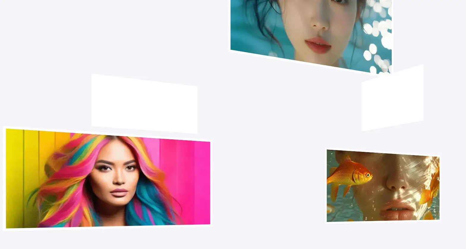
自动旋转的3D相册,击图片时应该能够放大显示大图,并且具有平滑的动画效果。
关键点总结
HTML结构
<div class="album-container">: 包含整个旋转相册的容器。<div class="album">: 实际的相册元素,包含多个图片框架。<div class="photo-frame">: 每个图片框架,包含一个图片。<div id="myModal" class="modal">: 模态框,用于显示放大的图片。<img class="modal-content" id="img01">: 放大显示的图片。<span class="close">×</span>: 关闭按钮,用于关闭模态框。
CSS样式
.album-container: 设置相册容器的大小和透视效果。.album: 设置相册的3D变换效果和自动旋转动画。.photo-frame: 设置每个图片框架的大小、边框和背景颜色,并应用3D变换效果。.photo-frame img: 设置图片的显示方式和隐藏背面。.photo-frame:nth-child(n): 预设每个图片框架的位置和角度,形成3D立体效果。@keyframes rotate: 定义相册旋转的动画效果。.modal: 设置模态框的样式,使其覆盖整个屏幕,并添加背景颜色过渡效果。.modal.show: 显示模态框时的样式变化。.modal-content: 设置放大显示的图片样式,并添加透明度和缩放过渡效果。.modal-content.show: 显示放大图片时的样式变化。.close: 设置关闭按钮的样式。
JavaScript交互
- 获取模态框 (
var modal = document.getElementById("myModal")): - 获取模态框元素以便后续操作。
- 点击图片放大 (
images.forEach): - 为每个图片添加点击事件监听器。
- 点击图片时,首先将模态框的
display属性设置为block,确保模态框可见。 - 设置放大图片的
src属性。 - 使用
setTimeout添加一个小的延迟,确保在模态框显示后立即添加show类以触发过渡效果。 - 关闭模态框 (
span.onclick和window.onclick): - 移除
show类以触发过渡效果。 - 使用
setTimeout在过渡完成后将模态框的display属性设置为none,确保模态框完全隐藏。
<!DOCTYPE html>
<html lang="en">
<head>
<meta charset="UTF-8">
<meta name="viewport" content="width=device-width, initial-scale=1.0">
<title>带有点击放大功能的3D旋转相册</title>
<style>
body {
margin: 0;
overflow: hidden;
background-color: #f4f4f9;
display: flex;
justify-content: center;
align-items: center;
height: 100vh;
position: relative;
}
.album-container {
position: relative;
width: 60vw;
height: 60vh;
perspective: 1000px;
}
.album {
position: absolute;
width: 100%;
height: 100%;
transform-style: preserve-3d;
animation: rotate 15s infinite linear;
}
.photo-frame {
position: absolute;
width: 20%;
height: 20%;
box-sizing: border-box;
border: 2px solid #fff;
background-color: #fff;
transform-style: preserve-3d;
transition: transform 0.5s ease;
cursor: pointer; /* 鼠标悬停时显示指针 */
}
.photo-frame img {
width: 100%;
height: 100%;
object-fit: cover;
backface-visibility: hidden;
}
/* 定位每个图片框架 */
.photo-frame:nth-child(1) { transform: translateZ(300px); }
.photo-frame:nth-child(2) { transform: rotateY(90deg) translateZ(300px); }
.photo-frame:nth-child(3) { transform: rotateY(180deg) translateZ(300px); }
.photo-frame:nth-child(4) { transform: rotateY(270deg) translateZ(300px); }
.photo-frame:nth-child(5) { transform: rotateX(90deg) translateZ(300px); }
.photo-frame:nth-child(6) { transform: rotateX(-90deg) translateZ(300px); }
.photo-frame:nth-child(7) { transform: translateX(150px) translateY(150px) translateZ(200px); }
.photo-frame:nth-child(8) { transform: translateX(-150px) translateY(-150px) translateZ(200px); }
.photo-frame:nth-child(9) { transform: translateX(150px) translateY(-150px) translateZ(200px); }
.photo-frame:nth-child(10) { transform: translateX(-150px) translateY(150px) translateZ(200px); }
@keyframes rotate {
from {
transform: rotateY(0deg);
}
to {
transform: rotateY(360deg);
}
}
/* 模态框样式 */
.modal {
display: none;
position: fixed;
z-index: 1;
left: 0;
top: 0;
width: 100%;
height: 100%;
overflow: auto;
background-color: rgba(0, 0, 0, 0);
transition: background-color 0.5s ease;
}
.modal.show {
background-color: rgba(0, 0, 0, 0.9);
}
.modal-content {
margin: 15% auto;
display: block;
width: 80%;
max-width: 700px;
opacity: 0;
transform: scale(0.8);
transition: opacity 0.5s ease, transform 0.5s ease;
}
.modal-content.show {
opacity: 1;
transform: scale(1);
}
.close {
position: absolute;
top: 15px;
right: 35px;
color: #f1f1f1;
font-size: 40px;
font-weight: bold;
transition: 0.3s;
}
.close:hover,
.close:focus {
color: #bbb;
text-decoration: none;
cursor: pointer;
}
</style>
</head>
<body>
<!-- 相册容器 -->
<div class="album-container">
<div class="album">
<div class="photo-frame"><img src="https://syjm.net/public/demo3.webp" alt="Image 1"></div>
<div class="photo-frame"><img src="https://syjm.net/public/demo2.webp" alt="Image 2"></div>
<div class="photo-frame"><img src="https://syjm.net/public/demo3.webp" alt="Image 3"></div>
<div class="photo-frame"><img src="https://syjm.net/public/demo4.webp" alt="Image 4"></div>
<div class="photo-frame"><img src="https://syjm.net/public/demo2.webp" alt="Image 5"></div>
<div class="photo-frame"><img src="https://syjm.net/public/demo4.webp" alt="Image 6"></div>
<div class="photo-frame"><img src="https://syjm.net/public/demo2.webp" alt="Image 7"></div>
<div class="photo-frame"><img src="https://syjm.net/public/demo3.webp" alt="Image 8"></div>
<div class="photo-frame"><img src="https://syjm.net/public/demo2.webp" alt="Image 9"></div>
<div class="photo-frame"><img src="https://syjm.net/public/demo_s.webp" alt="Image 10"></div>
</div>
</div>
<!-- 模态框 -->
<div id="myModal" class="modal">
<span class="close">×</span>
<img class="modal-content" id="img01">
</div>
<script>
// 获取模态框元素
var modal = document.getElementById("myModal");
// 获取所有图片,并为每张图片添加点击事件监听器
var images = document.querySelectorAll('.photo-frame img');
var modalImg = document.getElementById("img01");
images.forEach(function(img) {
img.onclick = function(){
modal.style.display = "block"; // 确保模态框可见
modalImg.src = this.src; // 设置放大图片的src属性
setTimeout(() => {
modal.classList.add("show"); // 添加show类以触发过渡效果
modalImg.classList.add("show"); // 添加show类以触发过渡效果
}, 10); // 小延迟确保过渡效果开始后才显示模态框
}
});
// 获取关闭按钮元素
var span = document.getElementsByClassName("close")[0];
// 当用户点击关闭按钮时
span.onclick = function() {
modalImg.classList.remove("show"); // 移除show类以触发过渡效果
modal.classList.remove("show"); // 移除show类以触发过渡效果
setTimeout(() => {
modal.style.display = "none"; // 过渡完成后隐藏模态框
}, 500); // 延迟确保过渡完成后再隐藏模态框
}
// 当用户点击模态框外部区域时
window.onclick = function(event) {
if (event.target == modal) {
modalImg.classList.remove("show"); // 移除show类以触发过渡效果
modal.classList.remove("show"); // 移除show类以触发过渡效果
setTimeout(() => {
modal.style.display = "none"; // 过渡完成后隐藏模态框
}, 500); // 延迟确保过渡完成后再隐藏模态框
}
}
</script>
</body>
</html>
No responses yet